Context
I've always had too many payment services. PayPal, Revolut, Satispay, Wise, a regular bank account — partly because I like testing new fintech products, partly because having multiple options means I can send and receive money from anyone, regardless of what they use.
Turns out most of my friends are the same. Everyone has 2, 3, sometimes 4 different payment apps installed.
The friction shows up in the most mundane moments: someone orders food delivery for the group, someone else organizes a birthday gift collection, you split the bill after dinner. Every single time, the same awkward conversation begins: "Do you have Satispay?" "No, send me your IBAN" "Actually, can you do PayPal?" "Wait, let me find the link..."
It's a small problem, but it happens constantly. And small frictions, repeated often enough, become genuinely annoying.
ROLE
notes
Vibecoding test
Year
2026
challenge
I wanted a single link I could share whenever someone needed to pay me — instead of sending different links depending on what payment app they use.
The solution needed to be:
Dead simple — no signup friction for the person paying
Service-agnostic — works with any payment method, not tied to one provider
Personal — feels like my page, not a generic form
Trustworthy — clean enough that people feel safe clicking payment links
I first built a quick personal version at leomoschen.com/pay. Just a static page with my payment methods listed. It worked. Friends started asking if they could have one too.
That's when the challenge evolved: turn a personal hack into a product anyone can use in minutes.
process
This is a 100% vibecoded project. I designed and developed everything myself, using AI as a coding partner.
Stack:
Next.js 16 with App Router
Supabase for authentication and database
Tailwind CSS v4 with OKLCH color tokens
shadcn/ui components
OpenAI GPT for automatic translations
Vercel for hosting and analytics
Time invested: ~20 hours of focused work
AI costs: ~$70 in credits (v0, Claude Sonnet, Claude Opus)
The workflow was iterative: I'd design a component or flow in my head, describe it to the AI, review the output, then refine until it matched my vision. For simpler parts, this worked smoothly. For anything involving specific interactions or visual details, it required multiple rounds of back-and-forth.
The hardest part wasn't generating code — it was getting the AI to respect specific design decisions. When you have a clear vision of how an interaction should feel, convincing the model to implement it exactly that way is a job in itself. Things break constantly. The AI suggests solutions that work technically but miss the point aesthetically or from a UX perspective.
This experience pushed me to start learning React and Next.js more seriously. Vibecoding is powerful for shipping fast, but understanding the underlying code makes the collaboration with AI far more effective. You catch mistakes earlier, you can fix things yourself, and you communicate requirements more precisely.
I see vibecoding not as a shortcut, but as a different way of building. The design thinking is still mine. The decisions are still mine. The AI accelerates execution, but it doesn't replace the "why" behind each choice.
Key decisions
Custom links vs. fixed usernames
The first version only supported fixed usernames. You sign up, you get okbutpay.me/yourname, done.
But real use cases are messier. What if you're collecting money for a specific event? What if you want a link that makes contextual sense — not just your name?
I decided to add custom links: any user can create additional URLs pointing to their payment page. Same payment methods, different entry point. Need a link for a group gift? Create okbutpay.me/marco-birthday. Collecting for a trip? okbutpay.me/berlin-2025.
This decision tripled the complexity. URL validation, conflicts with existing usernames, edge cases where someone tries to create a custom link that matches another user's username. The database schema got heavier. The UI needed to explain a feature that wasn't obvious.
But it was the right call. Custom links transform the product from "nice to have" to "genuinely useful." It's the difference between a personal tool and something worth recommending.
Automatic translations
The person paying might not speak your language. If I share my link with a German colleague, they shouldn't struggle with Italian descriptions.
I integrated OpenAI's API for automatic translations. When you write a custom description, the system detects the language and translates it into the other three supported languages (Italian, English, French, Spanish).
The pay page checks the visitor's browser language and shows everything translated — no toggle, no extra click. It just works.
Predefined descriptions have translations stored in the database. Custom descriptions get translated on the fly via GPT. This added real value with relatively low complexity on the user side.
Mobile-first, radically minimal
Payment pages need to load fast and feel trustworthy. Nobody sends money through a page that looks sketchy.
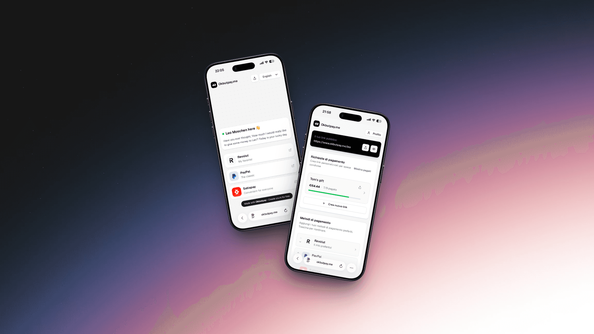
I went extremely minimal: white background, Geist typography, subtle dot pattern, generous spacing. Each payment method is a card with service icon, name, and description. Tap to pay or copy IBAN.
The press animation on cards (scale 0.97) adds tactile feedback without distraction. On desktop, a QR code appears for quick in-person sharing.
Every visual choice serves trust and clarity. Nothing decorative, nothing in the way.
Outcome
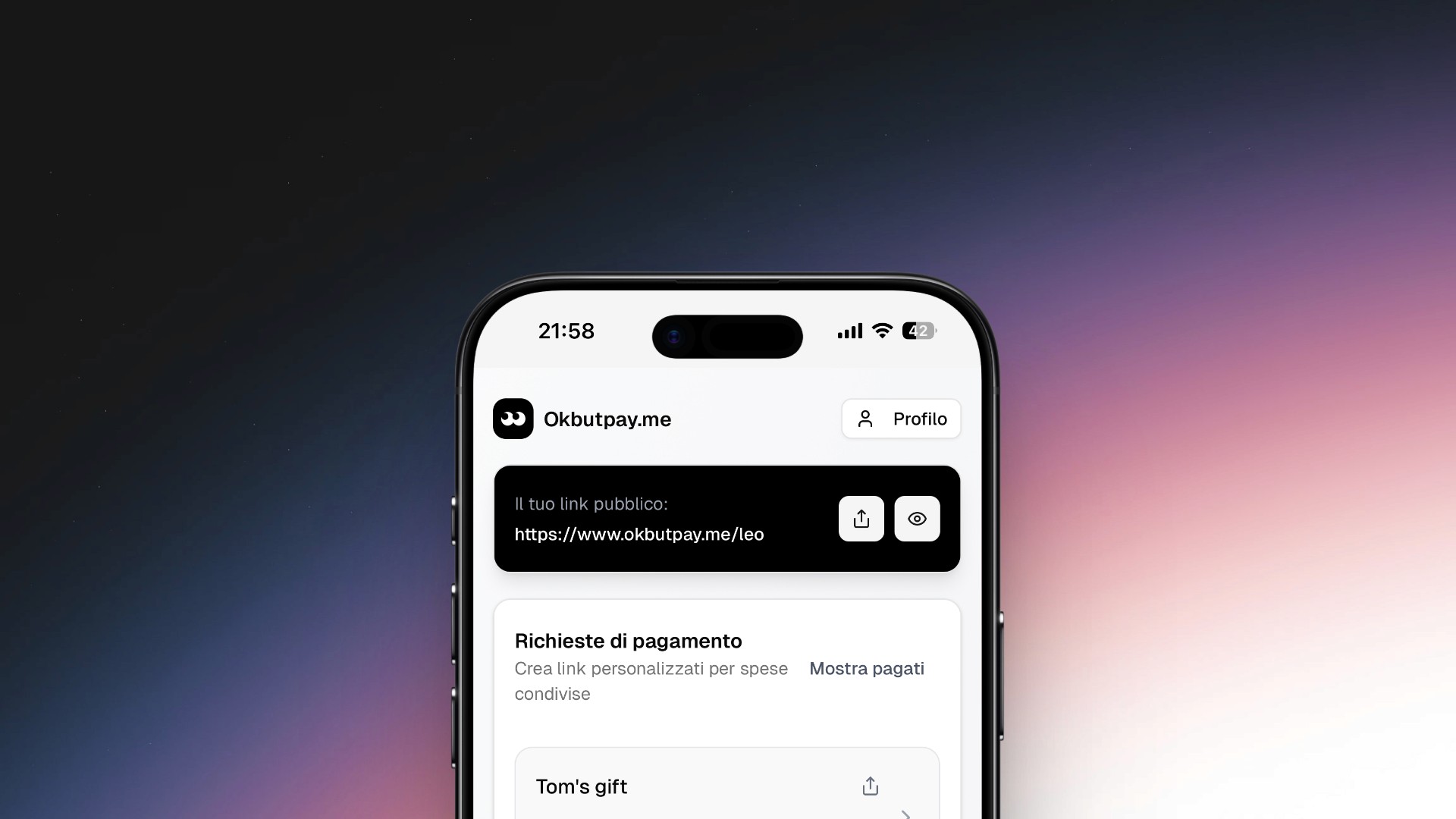
Okbutpay.me is a personal page where you collect all your payment methods. Instead of sharing multiple links for PayPal, Revolut, Satispay, IBAN — you share one.
The person paying opens your page, sees all options, picks the one that works for them, and pays. No signup required, no app to download.
Core features:
Personalized public page (okbutpay.me/yourname)
Support for PayPal, Revolut, Satispay, Wise, IBAN, and custom links
Automatic translation into 4 languages
Custom URLs for specific situations (events, group gifts, trips)
QR code for in-person sharing
Results: The product is live. I use it daily.
Several friends and colleagues have created their own pages. The consistent feedback: "Finally I don't have to send 4 different messages." No big launch yet, no marketing — just a working tool that solves a real problem.
For a side project built in 20 hours, shipping something that people actually use feels like a win. The bigger lesson: combining design thinking with AI-assisted development makes it possible to go from idea to live product faster than ever — without sacrificing quality.


