
Context
ROLE
worked for
TAG master, Sketchin jury
Year
2022
In late 2022, I was wrapping up my UX Design specialization at Talent Garden. The final challenge: design a mobile app. That's it. No client, no predefined problem, no guardrails — just "build something that solves a real problem."
The openness was intimidating. With infinite directions to choose from, I decided to start from what I knew: my own frustrations.
Every morning, the same scene: standing in front of the closet, staring at clothes, trying to figure out what to wear. It sounds trivial, but it's a daily micro-decision that drains more mental energy than it should — especially when you're already running late or just not in the mood to think about it.
I've always been that person. Too many options, not enough clarity. Some days I'd change outfits three times before leaving. Other days I'd just grab whatever and feel slightly off for the rest of the day.
The problem felt right: universal enough that most people get it immediately, personal enough that I could bring real empathy to the research.
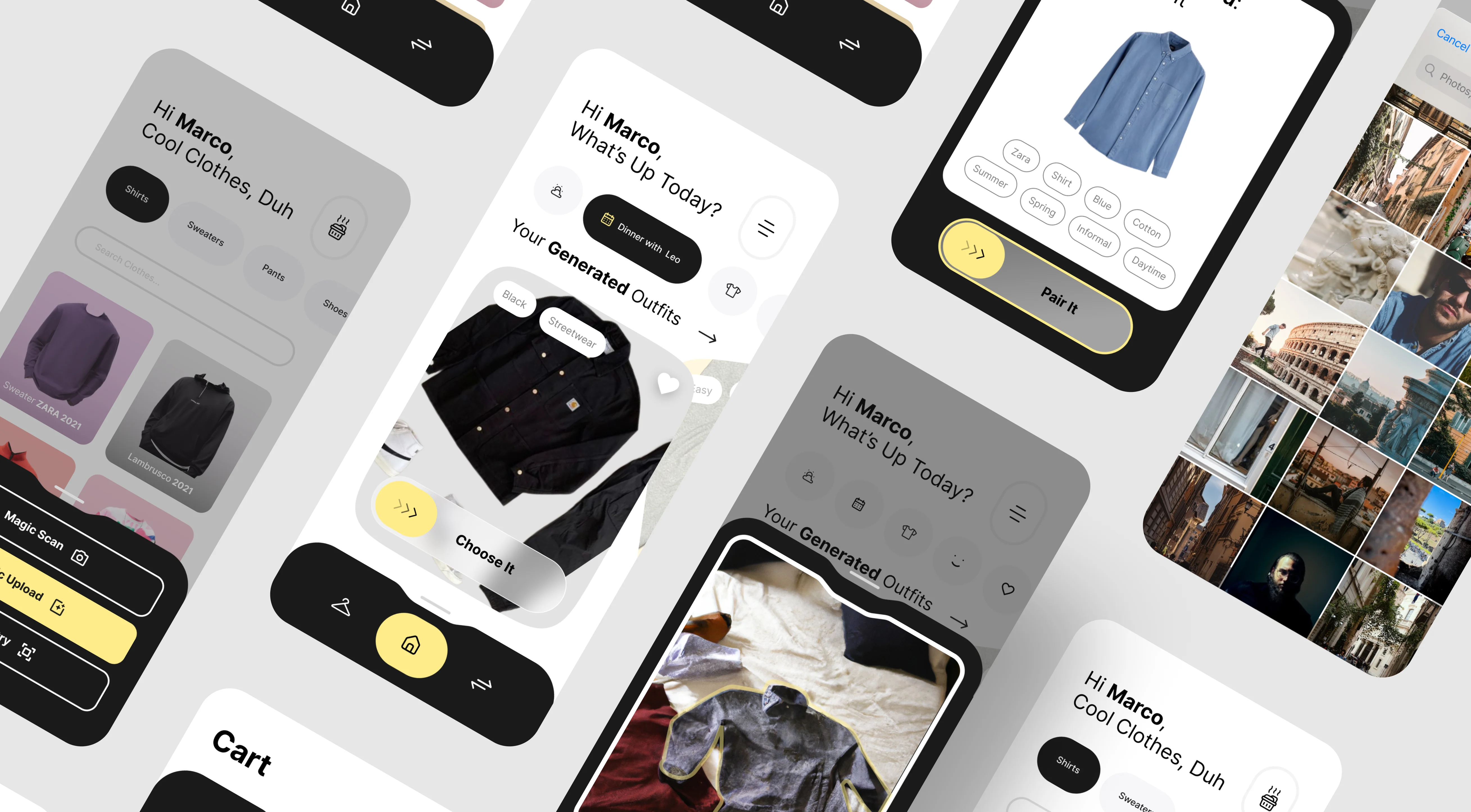
Monk is the result — an AI-powered app concept designed to simplify daily outfit decisions. Less time staring at the closet, more confidence walking out the door.
challenge
The brief was radically open: design a mobile app in 30 days. No topic assigned, no problem defined, no constraints beyond the deadline.
That freedom was the first challenge. With no direction given, everything depended on finding a problem worth solving — and proving it was real.
I chose to tackle decision fatigue around clothing. But "I don't know what to wear" isn't a design brief. I needed to dig deeper: Why does it feel hard? When does it happen most? What would "solved" actually look like?
After initial research, I defined my own constraints:
Minimize daily effort — no complex inputs, no lengthy setup
Learn over time — get smarter about preferences without explicit configuration
Feel personal — not a generic fashion app, but something tailored to your actual wardrobe
Work with what you own — a tool for your existing clothes, not another shopping platform
Competitors existed, but most failed on onboarding — requiring users to photograph their entire wardrobe before getting any value. I thought: there's room to do this better.

process
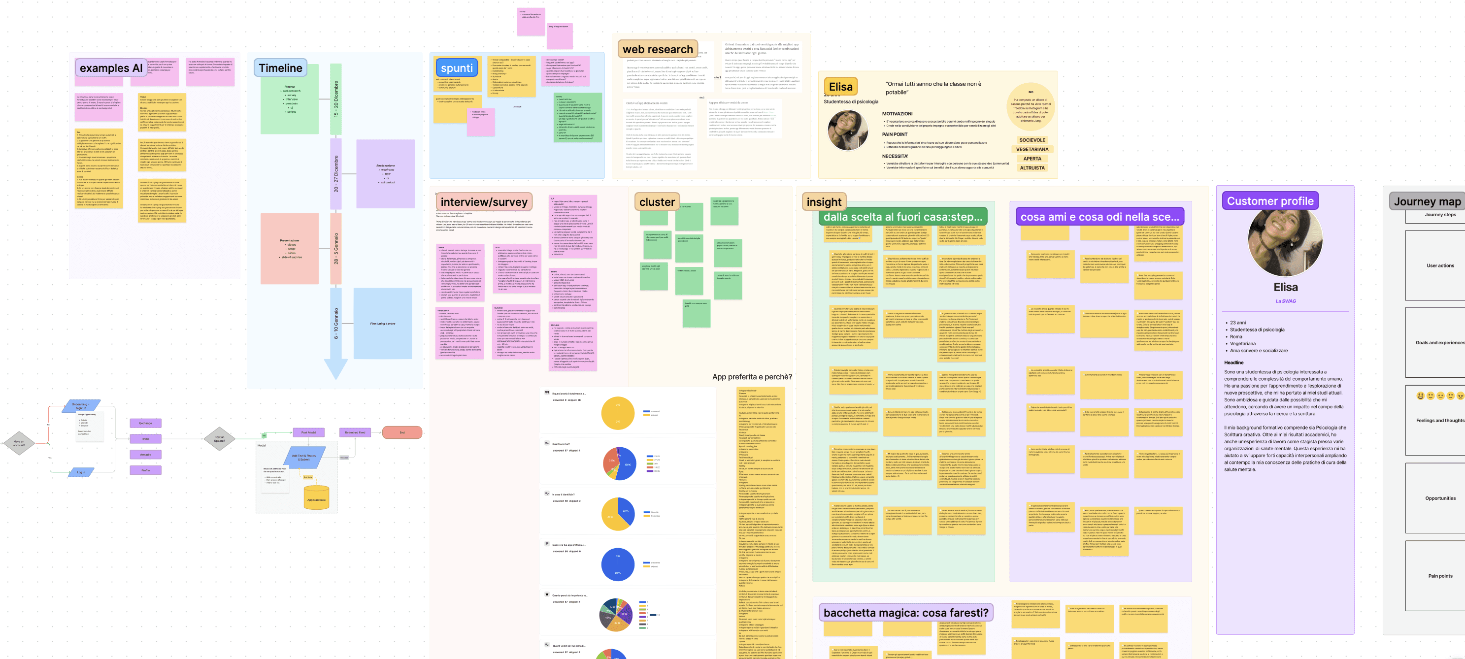
I split the project roughly in half: two weeks of research, two weeks of design.
Research phase: I conducted around 10 interviews with potential users — people in my network who I knew struggled with similar daily decisions. The goal was to understand the emotional layer behind the problem: why does choosing an outfit feel hard? What makes a "good outfit day" different from a bad one? When do people feel most confident?
Key insight: the problem wasn't really about fashion knowledge. It was about decision fatigue and context mismatch — wearing something that doesn't fit the day's situation (weather, meetings, mood) and only realizing it later.
Design phase: I mapped out user flows prioritizing simplicity. The core interaction had to be almost effortless — open the app, get a suggestion, go. Anything requiring too much daily input would fail.
This was late 2022. AI and machine learning weren't mainstream yet — ChatGPT had just launched, and most people still thought of AI as something for tech nerds. But I saw an opportunity: what if the app could learn your preferences over time, suggest outfits based on weather and calendar, and get better the more you used it?
I designed the concept around this premise: an AI assistant for your wardrobe that starts simple and grows smarter.
Tools: Everything was done in Figma — wireframes, user flows, final UI, and interactive prototype.
Key decisions
AI as invisible helper, not main feature
It would've been easy to make "AI-powered" the hero of the app — lots of onboarding explaining how smart it is, dashboards showing learning progress, settings to tweak the algorithm.
I went the opposite direction. The AI should be invisible. Users don't care how it works — they care that it works. The app suggests an outfit, you accept or reject it, done. Every interaction trains the model, but you never have to think about it.
This decision shaped the entire UI: minimal controls, no complex settings, confidence in defaults. The smartest technology often feels like no technology at all.
Wardrobe digitization as gradual process
A common failure mode for wardrobe apps: they require you to photograph and catalog your entire closet before you can do anything useful. That's a massive barrier. Nobody wants to spend a Sunday photographing 80 items of clothing.
I designed the onboarding to be incremental. Start with a few key pieces. Add more over time, whenever you want. The app works with 5 items or 500 — it just gets more accurate as your digital wardrobe grows.
This "progressive onboarding" approach was inspired by how the best products let you start getting value immediately, then deepen engagement gradually.
Context-aware suggestions
An outfit that works for a home office day doesn't work for a client meeting. What's comfortable in July is wrong in December.
I integrated contextual signals into the suggestion logic: weather data, calendar events (if connected), time of day, and user-defined "outfit modes" (casual, work, going out). The app doesn't just suggest clothes — it suggests clothes that make sense for today specifically.
This was the insight that elevated the concept beyond a simple "random outfit generator."
Outcome
Monk is a mobile app that suggests daily outfits based on your wardrobe, preferences, and context.
Core features:
Digital wardrobe with incremental setup
Daily outfit suggestions powered by AI
Context-awareness: weather, calendar, occasion
Simple feedback loop: accept, reject, or tweak — every choice improves future suggestions
Saved outfits for quick repeat access
The outcome: The project was evaluated by the entire Sketchin team alongside 40 other students. Monk received the highest scores in the class.
Luca Mascaro, CEO of Sketchin, commented "Perfect" — something the program directors said had never happened before.
More importantly: this project opened doors. It's what got me noticed and led to my role at Sketchin. Years later, Monk is still used as a reference project for the UX Master. Every year, students reach out to ask for advice, telling me they used it as their benchmark.
For a 30-day student project, the impact went far beyond the classroom.
Honest reflection: Looking at it today, I see everything I'd do differently. The visual hierarchy needs work. Typography choices aren't as refined as they should be. Auto-layout is messy in places. And there's a back arrow pointing right instead of left that still haunts me.
But that's the point. This project captured where I was as a designer in 2022. The thinking was solid — solid enough to stand out. The craft has grown since then.


